11 Temmuz 2012 Çarşamba
10 Temmuz 2012 Salı
9 Temmuz 2012 Pazartesi
Monopoly Houses in Evanston, #2
To contact us Click HERE
A few months back I posted about some mid-century Evanston homes on Crawford designed to evoke the traditional housing form (a box with a gable roof) while giving a nod to popular mid-century design. So in keeping with that investigation here's another grouping of minimal traditional homes on Main and Dewey.

My first thought was that these homes represented an early planned development, which would have allowed them to be arranged around a single parcel of land. But in fact they're all located on individual lots. The central houses have been pushed back to provide large front yards, while the houses at the ends are rotated and moved forward to create a sort of communal courtyard. One front fence would pretty much spoil the effect, but perhaps there are agreements in place to avoid this. There are two distinct groupings, but for clarity I only drew the one on the east.
The Cook County Assessor estimates the construction date as 1952 for all of these homes, but I found their footprints in the 1950 Sanborn Map of Evanston. No insult to the assessor, but I'm going to go with the Sanborn Map. Upon construction all of these homes were nearly identitical, but they've been altered and enlarged differently over time. Still, even the largest is only around 1,100 sq.ft.
 |
| From the 1950 Sanborn Map |
The Cook County Assessor estimates the construction date as 1952 for all of these homes, but I found their footprints in the 1950 Sanborn Map of Evanston. No insult to the assessor, but I'm going to go with the Sanborn Map. Upon construction all of these homes were nearly identitical, but they've been altered and enlarged differently over time. Still, even the largest is only around 1,100 sq.ft.
Sheridan and Albion, 1937
To contact us Click HERE
OK, here's the last of my images adapted from the IDOT photo archive of Chicago intersections. This filling station at the Northeast corner of Sheridan and Albion was a particularly solid design, and I'm struck by how similar it is to modern gas stations. There are drive-through pumps accessible on either side for motorists who just need a fill-up, and garage bays for more in-depth servicing.

 This is one of those images that benefits from the site plan (courtesy of the Sanborn Fire Insurance Map of 1937). The sales area and the service bays sort of pinwheel against each other, with the underground gas tanks at the rear. I imagine the space behind was for storing cars.
If you look in the drawing you can see the outline of the adjacent house to the North, along with two huge billboards angled towards the street. These were located on the vacant lot between the house and the filling station. Compared to the 1930s we get off easy when it comes to signage. Anyone with plot of land could apparently erect an enormous sign if they could find someone willing to pay for it. Now you can't put up a sign larger than 100 sq.ft. without an order from City Council. But I'm not a huge fan of billboards, so I'm not complaining.
It makes sense to place filling stations on the corner, where it can have access to two streets. But why did the station itself have to be located in the center of the lot? If I could go back in time and make a few suggestions it would be to locate gas stations on the corner of the lot and have the pumps and service areas in the back. This would be an especially good treatment in dense urban areas, where the service station disrupts the streetscape. This gas station was on the corner of a residential block and at least tried to retain a little grassy area near the sidewalk.
So this might be the last gas station for a bit, although I found another good one on Clark and a tiny one on Sheridan. I'm trying to limit thematic postings to three. For now. Until I return to Sheridan Road please enjoy this great pictorial that makes use of the same IDOT photos I've been admiring.
This is one of those images that benefits from the site plan (courtesy of the Sanborn Fire Insurance Map of 1937). The sales area and the service bays sort of pinwheel against each other, with the underground gas tanks at the rear. I imagine the space behind was for storing cars.If you look in the drawing you can see the outline of the adjacent house to the North, along with two huge billboards angled towards the street. These were located on the vacant lot between the house and the filling station. Compared to the 1930s we get off easy when it comes to signage. Anyone with plot of land could apparently erect an enormous sign if they could find someone willing to pay for it. Now you can't put up a sign larger than 100 sq.ft. without an order from City Council. But I'm not a huge fan of billboards, so I'm not complaining.
It makes sense to place filling stations on the corner, where it can have access to two streets. But why did the station itself have to be located in the center of the lot? If I could go back in time and make a few suggestions it would be to locate gas stations on the corner of the lot and have the pumps and service areas in the back. This would be an especially good treatment in dense urban areas, where the service station disrupts the streetscape. This gas station was on the corner of a residential block and at least tried to retain a little grassy area near the sidewalk.
So this might be the last gas station for a bit, although I found another good one on Clark and a tiny one on Sheridan. I'm trying to limit thematic postings to three. For now. Until I return to Sheridan Road please enjoy this great pictorial that makes use of the same IDOT photos I've been admiring.
2200 block of Estes, 1916
To contact us Click HERE
 To the right is a very nicely maintained Craftsman-style home on Estes, between Ridge and Western. I'm not giving an exact address because this is a commissioned home portrait and I don't want to freak out the owners. Although with a little investigation you could figure it out.
I don't usually do commissions of any sort, but now and then I'll donate a drawing for a good cause. In this case there was silent auction to benefit my son's new school, Stone Academy. Stone does an amazing job supplementing its curriculum in technology and the fine arts, and much of that is through parent-led fundraising. So this is my small contribution to that effort. The winner of the bid got to choose whatever they wanted to include in the drawing.
It's been a while since I've focused on a single building. It makes me think about technical issues rather than historical ones. For instance, what's the best way to match the scale of the drawing to the level of detail needed? What's the correct balance of black and white? What's the proper relationship between realistic and impressionistic detail? What's the best way to focus attention on the house while still suggesting street context? All of these are important to the overall effect, and I haven't even touched on the distribution pattern of Craftmen-style homes throughout the West Ridge neighborhood. Maybe next time.
To the right is a very nicely maintained Craftsman-style home on Estes, between Ridge and Western. I'm not giving an exact address because this is a commissioned home portrait and I don't want to freak out the owners. Although with a little investigation you could figure it out.I don't usually do commissions of any sort, but now and then I'll donate a drawing for a good cause. In this case there was silent auction to benefit my son's new school, Stone Academy. Stone does an amazing job supplementing its curriculum in technology and the fine arts, and much of that is through parent-led fundraising. So this is my small contribution to that effort. The winner of the bid got to choose whatever they wanted to include in the drawing.
It's been a while since I've focused on a single building. It makes me think about technical issues rather than historical ones. For instance, what's the best way to match the scale of the drawing to the level of detail needed? What's the correct balance of black and white? What's the proper relationship between realistic and impressionistic detail? What's the best way to focus attention on the house while still suggesting street context? All of these are important to the overall effect, and I haven't even touched on the distribution pattern of Craftmen-style homes throughout the West Ridge neighborhood. Maybe next time.
Clark, Greenleaf, Ravenswood and Estes, Part 1
To contact us Click HERE
The biggest property disaster that I know of in Rogers Park was a fire that burned down nearly the entire block bounded by Clark, Greenleaf, Ravenswood and Estes. It was documented in the Chicago Tribune with a map of the burned area and a line drawing showing the destruction. I recreated the map in order to add labels, but I can't improve on the drawing, which somehow came through microfilming (and then scanning) with a good amount of its detail intact. Welcome to Rogers Park, 1894.
 The article mentions that 14 buildings were lost, including stores, factories and dwellings. It even provided a table itemizing the losses. I've done my best go through the description and map out where I believe everything was located, but I'm only about 70% sure of my accuracy.
But so what? There was a big fire in Rogers Park over a hundred years ago and a bunch of people lost their homes and businesses. How does that impact the neighborhood today? To investigate this maybe we need to go back another Chicago fire that's become a defining element in the conception of the modern Chicago.
After the fire of 1871 Chicago didn't rise from the ashes with dozens of skyscrapers stretching upward. The first steel frame skyscraper wasn't even constructed until 1884. Instead Chicago rebuilt itself much as it had been, except that the city government scrambled to adopt new building codes and regulations to minimize the chances of another catastrophic fire.
It took years to adopt the regulations for new fire-resistant and fireproof construction and property owners and builders screamed the entire way. (I definitely recommend Margaret Garb's "City of American Dreams" which describes this era vividly.) One outcome of this assertion of governmental responsibility was an overall strengthening of the administrative policies of Chicago related to building. This came to influence the look of the city far more than any fire. Height limits, minimum construction standards, setbacks, exiting requirements, etc. all became a part of the modern Chicago.
Rogers Park was annexed to Chicago a year before the fire, in 1893. This meant that any new development on the damaged block had to conform to the new construction standards. So this disaster provides me with something useful-- a clean slate. Periodically I'm going to be taking a closer look at how this block developed post-fire, and what it might reveal about Rogers Park in particular and about Chicago in general.
 |
| Looking Northeast through the burned area. From the August 9th, 1894 Chicago Tribune. |
The article mentions that 14 buildings were lost, including stores, factories and dwellings. It even provided a table itemizing the losses. I've done my best go through the description and map out where I believe everything was located, but I'm only about 70% sure of my accuracy.But so what? There was a big fire in Rogers Park over a hundred years ago and a bunch of people lost their homes and businesses. How does that impact the neighborhood today? To investigate this maybe we need to go back another Chicago fire that's become a defining element in the conception of the modern Chicago.
After the fire of 1871 Chicago didn't rise from the ashes with dozens of skyscrapers stretching upward. The first steel frame skyscraper wasn't even constructed until 1884. Instead Chicago rebuilt itself much as it had been, except that the city government scrambled to adopt new building codes and regulations to minimize the chances of another catastrophic fire.
It took years to adopt the regulations for new fire-resistant and fireproof construction and property owners and builders screamed the entire way. (I definitely recommend Margaret Garb's "City of American Dreams" which describes this era vividly.) One outcome of this assertion of governmental responsibility was an overall strengthening of the administrative policies of Chicago related to building. This came to influence the look of the city far more than any fire. Height limits, minimum construction standards, setbacks, exiting requirements, etc. all became a part of the modern Chicago.
Rogers Park was annexed to Chicago a year before the fire, in 1893. This meant that any new development on the damaged block had to conform to the new construction standards. So this disaster provides me with something useful-- a clean slate. Periodically I'm going to be taking a closer look at how this block developed post-fire, and what it might reveal about Rogers Park in particular and about Chicago in general.
7600-7602 N. Sheridan - Apartments of the Better Class
To contact us Click HERE
OK, last one! It's taken me nearly a year to post these seven Rogers Park apartment buildings featured in Partridge and Bradley's 1917 catalog, "Directory to Apartments of the Better Class on the North Side of Chicago". Why are they better class? I'm not really sure. But here's my imagined list of titles they considered yet ultimately rejected:
Apartments for Awesome PeopleClassy Classy! Apartments!Not a Flophouse
As Partridge and Bradley explain in their introduction, they focused on people who could choose to live in a private house but prefered the luxury and economy of apartment buildings. And many of these apartments really were luxurious, with individual laundries, wine cellars, private garages, elevators, electric appliances, etc. The largest apartment represented had 15 rooms. Rogers Park contains the more modest examples.
 The view shown above is at the Northwest corner of the Sheridan and Howard. Except for the loss of the tall casement windows and roof tile on the front gables it looks pretty much as it did. It nearly fills the entire lot, with no room reserved for garages or green space. Here's the desciption:
 So if it was trying to appeal to commuters who used public transit maybe it didn't need garage space. And with only steps to Lake Michigan who needs a yard, right? Like many of these apartments it advertises an interior scheme of mahogany and white enamel. The woodwork was probably birch, which was popular for its ability to take stains and finishes. And it was cheap. Saying that it had light on all four sides seems to be a bit optomistic, since the photo shows there was already a close neighbor on the North. As a corner lot it certainly has more light, but that also comes with more noise.
So it looks like there are three apartments per floor, with the smaller apartment located at the rear. The front units have a maid's room. All share a rear stair system, which may have also functioned as a light court.
The subdivision map shows that there was a 30 foot building line along Sheridan, so perhaps that explains the angles of the front porches. The units on Sheridan are classic Chicago apartments, with rooms arranged in a linear, cellular fashion.
I imagine the sunrooms were popular in the summertime, when the casement windows could be opened on all sides to catch the breezes from Lake Michigan.
Apartments for Awesome PeopleClassy Classy! Apartments!Not a Flophouse
As Partridge and Bradley explain in their introduction, they focused on people who could choose to live in a private house but prefered the luxury and economy of apartment buildings. And many of these apartments really were luxurious, with individual laundries, wine cellars, private garages, elevators, electric appliances, etc. The largest apartment represented had 15 rooms. Rogers Park contains the more modest examples.
The view shown above is at the Northwest corner of the Sheridan and Howard. Except for the loss of the tall casement windows and roof tile on the front gables it looks pretty much as it did. It nearly fills the entire lot, with no room reserved for garages or green space. Here's the desciption:So if it was trying to appeal to commuters who used public transit maybe it didn't need garage space. And with only steps to Lake Michigan who needs a yard, right? Like many of these apartments it advertises an interior scheme of mahogany and white enamel. The woodwork was probably birch, which was popular for its ability to take stains and finishes. And it was cheap. Saying that it had light on all four sides seems to be a bit optomistic, since the photo shows there was already a close neighbor on the North. As a corner lot it certainly has more light, but that also comes with more noise.
 |
| Click for larger version. |
So it looks like there are three apartments per floor, with the smaller apartment located at the rear. The front units have a maid's room. All share a rear stair system, which may have also functioned as a light court.
The subdivision map shows that there was a 30 foot building line along Sheridan, so perhaps that explains the angles of the front porches. The units on Sheridan are classic Chicago apartments, with rooms arranged in a linear, cellular fashion.
I imagine the sunrooms were popular in the summertime, when the casement windows could be opened on all sides to catch the breezes from Lake Michigan.
8 Temmuz 2012 Pazar
BBC podcasts: selected programs
To contact us Click HERE
 Here is the main page with all BBC podcasts. You can find a podcast by radio station or genre: http://www.bbc.co.uk/podcasts
Here are some selected programs:
The extensive audio archive of the weekly BBC program "In Our Time" is nicely categorized by topic:
BBC - Podcasts - In Our Time Archive: Science - http://goo.gl/yCXec
BBC - Podcasts - In Our Time Archive: History - http://goo.gl/mJa6j
BBC - Podcasts - In Our Time Archive: Culture - http://goo.gl/BTg6t
BBC - Podcasts - In Our Time Archive: Philosophy - http://goo.gl/vi5xf
BBC - Podcasts - In Our Time Archive: Religion - http://goo.gl/tgSdN
Here are some other BBC programs available as podcasts:
The Digital Human: BBC Podcast explores how digital culture is moulding modern living http://goo.gl/1jxKL
BBC - Podcasts - Kitchen Cabinet - http://goo.gl/WBE6d
BBC - Podcasts - Click - How digital technology affects our lives around the world http://goo.gl/Mz7a
BBC - Podcasts - Analysis - http://goo.gl/HMl2
BBC - Podcasts - A History of Mozart in a Dozen Objects - http://goo.gl/zo5iW
BBC - Podcasts - The Art of Monarchy - http://goo.gl/H4pK9
Medical Podcasts
Medical Matters
Health Check
Science Podcasts
The Life Scientific (BBC podcast): Each week, a leading scientist talks about their life and work http://goo.gl/2FQyY
BBC - Podcasts - A Brief History of Mathematics - http://goo.gl/q0pxn
Best of Natural History Radio
Material World
One Planet
Travel Podcasts
Crossing Continents
Excess Baggage
You can subscribe to all BBC with one click via the OPML feed (warning: this file probably contains too many podcasts for the average user): http://www.bbc.co.uk/podcasts.opml
Image source: OpenClipArt.org, public domain.
EarthBox garden container for vegetables
To contact us Click HERE
Sub-irrigated planter (SIP) is a generic name for a planting box used in container gardening and commercial landscaping. A SIP is any method of watering plants where the water is introduced from the bottom, allowing the water to soak upwards to the plant through capillary action. SIP's are available as products, under brand names such as EarthBox, Grow Box, Earthainer, or as do-it-yourself projects made from plastic buckets and boxes.
The patented EarthBox was developed by commercial farmers. The EarthBox measures 30 by 13-1/2 by 12 inches (l x w x h) for a soil capacity of 2-1/2 cubic feet. The box rests on four wheels and easily rolls into full sun and then moves to the back row so another Earthbox can get sun rays. The growing kit includes fertilizer, dolomite, and two germination covers. EarthBox is expensive at $44 to $55 (with shipping).
Blake Whisenant, Inventor of the Earthbox, demonstrates how it works:
Hoss Morgan tours Whisenant Farms in Florida where the EarthBox is used for commercial production of organic tomatoes:
There is a Junior EarthBox at half the price ($23) and size of the original EarthBox. The EarthBox Junior Garden Kit includes: Jr. EarthBox container, Jr. Aeration Screen, Jr. Water Fill Tube, 2 reversible B/W Jr. Mulch Covers, 4 Saucer, 8 oz. 7-7-7 fertilizer, 8 oz. dolomite.
Here are some videos from the EarthBox's YouTube channel:
Planting a Double Row Crop:
Rick's Rooftop: Rick Bayless from PBS's Mexico: One Plate at a Time talks about the importance of freshness and local produce in his EarthBox garden on the roof of Frontera Grill in Chicago:
EarthBox inventor Blake Whisenant answers your gardening questions: Blake's Tips & Tricks: Tomato Ailments:
Here is how make your own "EarthBox"-like container: Homemade Self-Contained Gardening Systems - http://goo.gl/gbIf4
Global Bucket is DIY container growing system with two 5-gallon bucket, supposedely similar to Earthbox http://www.globalbuckets.org:
Related:
Earthbox Gardening | Steamy Kitchen Recipes http://goo.gl/bnWFm
Homemade Self-Contained Gardening Systems http://goo.gl/gbIf4
Suburban Renewal One Backyard at a Time: converting grass to vegetable gardens
To contact us Click HERE
Most of the videos are from the "Peak Moment" program YouTube channel.
Jan Spencer shows his quarter-acre permaculture project transforming a typical suburban lot. Lawn and driveway were replaced with fruit and nut trees, vegetables, brambles, and native habitat, plus a 3500 gallon rainwater catchment system, a sunroom heating the house, and a small detached bungalow to increase residential density:
Related:
How Much Food Can I Grow Around My House? - YouTube - http://goo.gl/Kgko6
Suburban Permaculture w/ Janet Barocco and Richard Heinberg - YouTube - http://goo.gl/PHBVX
An Experiment in Back Yard Sustainability - YouTube - http://goo.gl/zqwzv
Four Acres and Independence - A Self-Sufficient Farmstead - YouTube - http://goo.gl/mjMbF
A Geodesic Greenhouse — Year-Round Gardening at 6000 Feet - YouTube - http://goo.gl/Ia053
Raised Bed Vegetable Garden Install from Start to Finish - YouTube - http://goo.gl/xaGtl
"Owner's and Instruction Manual" books for cats, dogs and humans
To contact us Click HERE
From Amazon:
The Teen Owner’s Manual is here to answer your most pressing questions: How can I teach my teenager to make smart decisions? How do I keep her safe on the Web? How do I get him to communicate? How and when should I talk to her about sex? Whatever your concerns, you’ll find the answers right here—courtesy of parenting author Sarah Jordan and adolescent medicine specialist Dr. Janice Hillman.
The "Owner's and Instruction Manual" series of books covers a wide range of topics - see most of them here: http://amzn.to/MLSAvy
Where do you want to go today?
To contact us Click HERE
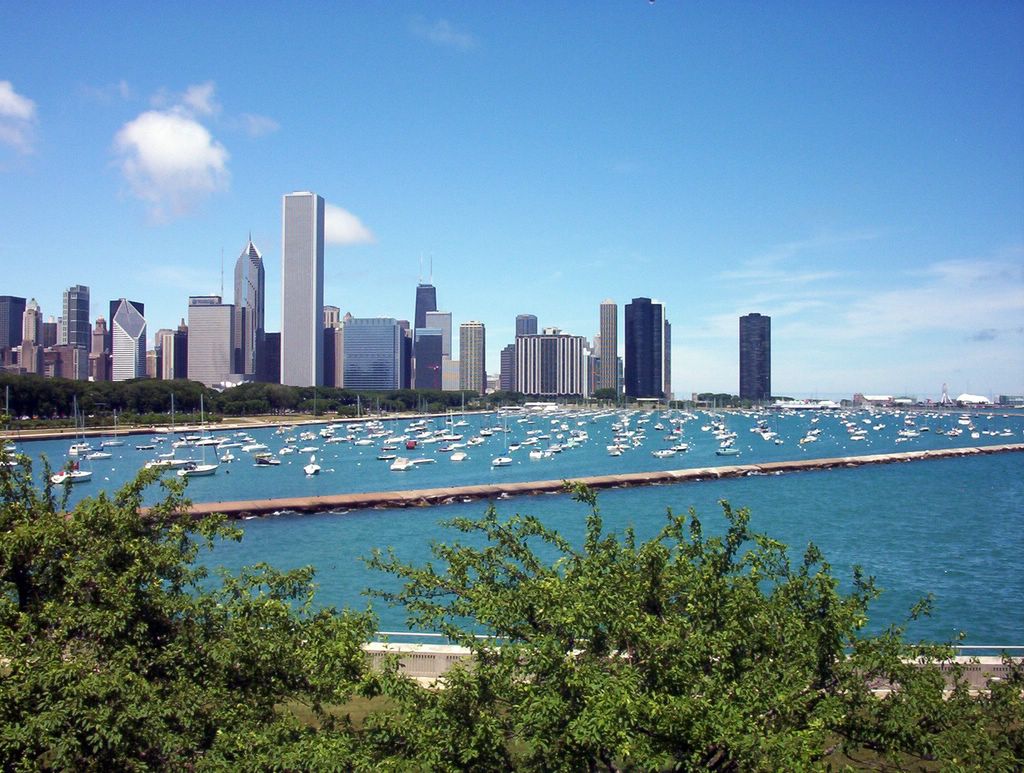 Chicago, Illinois
John Hancock Observatory
Art Institute of Chicago
Shedd Aquarium
Navy Pier
Chicago Botanic Garden during summer and early fall
Chicago (overview)
Downtown Chicago
Lincoln Park Zoo
 Cleveland and Cleveland Zoo
Australian Adventure at Cleveland Zoo
African Savanna at Cleveland ZooPlaces to visit in and around Cleveland, a general starting point, for specific places look below
Vermilion, a 'New England' town on Lake Erie
Kelleys Island and Marblehead Lighthouse, a wonderful summer getaway
Northern Trek in the Spring
Rain Forest at Cleveland Zoo
Click here to read more
Ohio
 Stan Hywet Hall: An Old English Style Mansion in Akron
Stan Hywet Hall & Gardens in Akron, Ohio
Akron Zoo: There is only one inch between you and the tiger
Legends of the Wild
Tiger Valley
Asian Trail
Click here to read more
Midwest
Chicago, Illinois
Cathedral of Saint Paul and State Capitol in Saint Paul, Minnesota
Minneapolis Sculpture Garden and Cowles Conservatory, Minnesota
Minnehaha Falls in Minneapolis, MinnesotaBig Boy Steam Locomotive in Kenefick Park
Omaha Botanical Gardens
First ever pedestrian bridge to connect 2 statesClick here to read more
Northeast
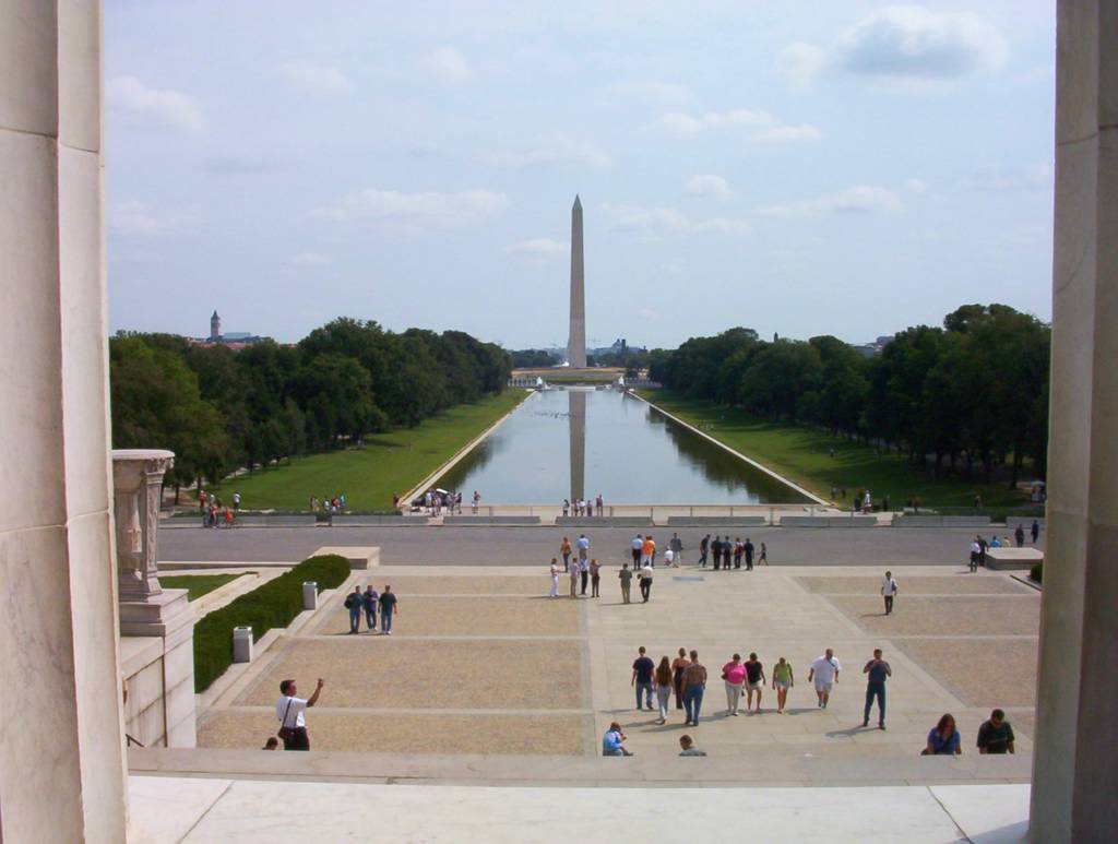 Washington, D.C.: So Many Things to See, So Little Time
In New York City for 20 Hours
Niagara Falls, New York
Pittsburgh, Pennsylvania: The City of Many Bridges
Phipps Conservatory and Botanical Gardens in Pittsburgh, Pennsylvania
Philadelphia: The Birthplace of America
Click here to read more
Southeast
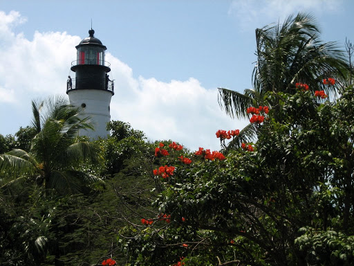 Key West
Sanibel Island
Disney World in Orlando
Shells of Honeymoon Island
Saint Petersburg
Clearwater
Miami Beach
South Beach
Click here to read more
West
 Seaport Village in Downtown San Diego, California
Balboa Park, San Diego, California
San Diego Zoo in Balboa Park, San Diego, California
Coronado, San Diego County, California
Downtown Seattle
Pike Place Public Market
Waterfront in Seattle
Click here to read more
Europe
 Sofia, Bulgaria
Rila Monastery, Bulgaria
Frescoes in the main church of Rila Monastery
Tsarevets stronghold in Veliko Tarnovo, Bulgaria
Monument of Founders of Second Bulgarian Empire in Veliko Tarnovo
Samovodska Charshiya Street in Old Town of Veliko Tarnovo, Bulgaria
Click here to read more
 Chicago, Illinois
 John Hancock Observatory
Art Institute of Chicago
Shedd Aquarium
Navy Pier
Chicago Botanic Garden during summer and early fall
Chicago (overview)
Downtown Chicago
Lincoln Park Zoo
 Cleveland and Cleveland Zoo
Australian Adventure at Cleveland Zoo
African Savanna at Cleveland ZooPlaces to visit in and around Cleveland, a general starting point, for specific places look below
Vermilion, a 'New England' town on Lake Erie
Kelleys Island and Marblehead Lighthouse, a wonderful summer getaway
Northern Trek in the Spring
Rain Forest at Cleveland Zoo
Click here to read more
Ohio
 Stan Hywet Hall: An Old English Style Mansion in Akron
Stan Hywet Hall & Gardens in Akron, Ohio
Akron Zoo: There is only one inch between you and the tiger
Legends of the Wild
Tiger Valley
Asian Trail
Click here to read more
Midwest
Chicago, IllinoisCathedral of Saint Paul and State Capitol in Saint Paul, Minnesota
Minneapolis Sculpture Garden and Cowles Conservatory, Minnesota
Minnehaha Falls in Minneapolis, MinnesotaBig Boy Steam Locomotive in Kenefick Park
Omaha Botanical Gardens
First ever pedestrian bridge to connect 2 statesClick here to read more
Northeast
 Washington, D.C.: So Many Things to See, So Little Time
In New York City for 20 Hours
Niagara Falls, New York
Pittsburgh, Pennsylvania: The City of Many Bridges
Phipps Conservatory and Botanical Gardens in Pittsburgh, Pennsylvania
Philadelphia: The Birthplace of America
Click here to read more
Southeast
 Key West
Sanibel Island
Disney World in Orlando
Shells of Honeymoon Island
Saint Petersburg
Clearwater
Miami Beach
South Beach
Click here to read more
West
 Seaport Village in Downtown San Diego, California
Balboa Park, San Diego, California
San Diego Zoo in Balboa Park, San Diego, California
Coronado, San Diego County, California
Downtown Seattle
Pike Place Public Market
Waterfront in Seattle
Click here to read more
Europe
 Sofia, Bulgaria
Rila Monastery, Bulgaria
Frescoes in the main church of Rila Monastery
Tsarevets stronghold in Veliko Tarnovo, Bulgaria
Monument of Founders of Second Bulgarian Empire in Veliko Tarnovo
Samovodska Charshiya Street in Old Town of Veliko Tarnovo, Bulgaria
Click here to read more
7 Temmuz 2012 Cumartesi
Clark, Greenleaf, Ravenswood and Estes- Part 2
To contact us Click HERE
Anybody who studies American cities knows the value of the Sanborn Fire Insurance Maps. These were created by the Sanborn Map Company to help insurance adjusters evaluate risk. Copies of all maps were deposited with the Library of Congress, and were later microfilmed for distribution to local libraries. An agreement with ProQuest put scanned versions of the microfilmed maps (660,000 of them) online for subscription access.
The Chicago Public Library makes these maps available, so at least access is broadening. Many of the denser areas in Rogers Park were included in several editions. When these are compiled it provide a portrait of development through time. These maps are crammed with information, and the problem is often choosing which type of information is most useful to highlight.
 In this case the maps are focused on heights, with the light grey, dark grey and black showing 1, 2, and 3 stories respectively. It's also possible to focus on type of construction (frame, masonry veneer, steel reinforced concrete) or type of use. Cross reference this with extensive title research, census records, and phone directories and you can build up a fairly precise history of a block. In theory that block would reflect the larger trends of the neighborhood. But I still have to manage a job, a family and a life, so the next step may just be a somewhat closer look at each of these dates.
The Chicago Public Library makes these maps available, so at least access is broadening. Many of the denser areas in Rogers Park were included in several editions. When these are compiled it provide a portrait of development through time. These maps are crammed with information, and the problem is often choosing which type of information is most useful to highlight.
In this case the maps are focused on heights, with the light grey, dark grey and black showing 1, 2, and 3 stories respectively. It's also possible to focus on type of construction (frame, masonry veneer, steel reinforced concrete) or type of use. Cross reference this with extensive title research, census records, and phone directories and you can build up a fairly precise history of a block. In theory that block would reflect the larger trends of the neighborhood. But I still have to manage a job, a family and a life, so the next step may just be a somewhat closer look at each of these dates.
 |
| Bird's Eye Aerial from Bing. Probably 2008. |
Hamburger King, 3435 N. Sheffield
To contact us Click HERE
Today's post is courtesy of Harvey Pekar and artist Gary Dumm, from Pekar's "American Splendor #3," published in 1978. I never expected to find Hamburger King alive and well at Sheffield and Newport, but there it remains. The next time you're in Wrigleyville stop by, have a hamburger, and remember Harvey. He died in 2010.
Also, I have no rights to this work, so if anyone asks me to take it down I will.

Also, I have no rights to this work, so if anyone asks me to take it down I will.
Huge Crayfish on Clark and Wallen, 2006
To contact us Click HERE
I'm sorry to say that the giant crayfish is gone. These images were originally posted in 2006. The life of a taqueria on Clark is either wildly successful or very short. Mostly very short. This repost is my memorial...

 Show me the person who doesn't think a taqueria can be art.
Wouldn't it be interesting if all restaurants were required to incorporate their most popular dish into their signage? That would be useful for all of the Rogers Park tourists. There are Rogers Park tourists, right?
This huge crayfish started out a cheerful red, but the sun weathered it to a light orange.

Show me the person who doesn't think a taqueria can be art.Wouldn't it be interesting if all restaurants were required to incorporate their most popular dish into their signage? That would be useful for all of the Rogers Park tourists. There are Rogers Park tourists, right?
This huge crayfish started out a cheerful red, but the sun weathered it to a light orange.
Combining Styles, 2449 W. Devon and 1028 W. Chicago
To contact us Click HERE
Sometimes buildings change according to established patterns, like a sun-porch added to a farmhouse or a side wing on a mansion. But less work has been done on analyzing how historic commercial buildings change over time. In general the preservation community is focused on finding the best unaltered examples of building types. But there are many patterns which are just as valid in understanding the history of a property, even when they're not particularly picturesque. Take these 1-story additions to older 2-story commercial buildings.
 The older portions of these buildings observe two of the eclectic styles popular in the 1920s, Classical Revial and Italian Renaissance Revival. When the owners saw an opportunity for expansion they switched from the earlier style to new styles popular at the time. To the right they've chosen Art Deco, using glazed terra cotta blocks with fluted bands and geometric ornament. Below they've gone with stacked brick and permastone. There's absolutely no concern with matching the ornamentation of the older portion, or even aligning the new storefronts with the existing geometry. Why is that? A few thoughts:
1. The whole idea was to update the building, make it seem competitive and modern. Maintaining the original ornamentation wouldn't signal the desired excitement.
2. In the 20 years between initial construction and enlargement the entire building industry reoriented around new styles and new materials. The more traditional architectural treatments would have required a custom approach and therefore would have been much more expensive.
3. Advertising has changed, and the creation of large sign bands takes precedent over any "nostalgic" treatment. By extending the new storefront into and over the old portion the amount of advertising could be doubled to accomodate larger, more aggressive signage.
4. Many businesses in traditional commercial areas (Main Street) found that the space on the upper floors wasn't being utilized as intended. Living units above commercial spaces are generally less desirable than those on quiet streets. And despite the space added, it's still more expensive to build a two-story building. Expanding only the commercial space on the first floor is a reasonable solution.
Interestingly, the newer portions of the buildings were both from 1940s (as far as I can tell). Perhaps this was the last gasp of Art Deco and the first breath of 1950s Modern.
I'm on the lookout for more of these buildings which have expanded in interesting ways. I imagine putting together a booklet titled, "Messed Up Storefronts," although that might sound a bit prejudicial. So please email me if you know of any in your neighborhood.
The older portions of these buildings observe two of the eclectic styles popular in the 1920s, Classical Revial and Italian Renaissance Revival. When the owners saw an opportunity for expansion they switched from the earlier style to new styles popular at the time. To the right they've chosen Art Deco, using glazed terra cotta blocks with fluted bands and geometric ornament. Below they've gone with stacked brick and permastone. There's absolutely no concern with matching the ornamentation of the older portion, or even aligning the new storefronts with the existing geometry. Why is that? A few thoughts:1. The whole idea was to update the building, make it seem competitive and modern. Maintaining the original ornamentation wouldn't signal the desired excitement.
2. In the 20 years between initial construction and enlargement the entire building industry reoriented around new styles and new materials. The more traditional architectural treatments would have required a custom approach and therefore would have been much more expensive.
3. Advertising has changed, and the creation of large sign bands takes precedent over any "nostalgic" treatment. By extending the new storefront into and over the old portion the amount of advertising could be doubled to accomodate larger, more aggressive signage.
4. Many businesses in traditional commercial areas (Main Street) found that the space on the upper floors wasn't being utilized as intended. Living units above commercial spaces are generally less desirable than those on quiet streets. And despite the space added, it's still more expensive to build a two-story building. Expanding only the commercial space on the first floor is a reasonable solution.
Interestingly, the newer portions of the buildings were both from 1940s (as far as I can tell). Perhaps this was the last gasp of Art Deco and the first breath of 1950s Modern.
I'm on the lookout for more of these buildings which have expanded in interesting ways. I imagine putting together a booklet titled, "Messed Up Storefronts," although that might sound a bit prejudicial. So please email me if you know of any in your neighborhood.
Clark, Greeneaf, Ravenswood and Estes, Part 3
To contact us Click HERE
 A few months ago I did a series of posts about "backstage spaces," including some views through alleys focusing on rear lot structures. But if I wanted to crack open a city block to see what makes it tick I couldn't have done a better job than removing the Adelphi Theater at Estes and Clark, which had been on the site since 1912.
I was at home (a block away) when the Adelphi came down in February of 2006. I remember walking over to watch. They always demolish these buildings from the back. There are probably structural and safety reasons for this, but it also means that once the demolition is noticeable it's almost complete.
Early modernists claimed to prefer the backs of buildings rather than the ornamental front facades, since that was supposedly where the true structure was expressed. What you see here would likely please any number of architectural theorists from the 50s and 60s.
It is fascinating to see how these buildings developed over the years. I've tried to make them visually intelligible, but it's a tricky job.
If a building is only visible from a street the architect can focus the design (and dollars) on the front facade. Once something is demolished it reveals the areas intended to remain hidden. If it happens enough it changes the entire feel of a block, making it look slapped together, run-down and ready for the bulldozer. It may be all of those things, but usually what you're seeing is just the architectural vocabulary for functional spaces.
In the foreground is the foundation of a new condo building which was intended to replace the Adelphi Theater. The development stalled in the economic downturn and has remained vacant ever since.
A few months ago I did a series of posts about "backstage spaces," including some views through alleys focusing on rear lot structures. But if I wanted to crack open a city block to see what makes it tick I couldn't have done a better job than removing the Adelphi Theater at Estes and Clark, which had been on the site since 1912.I was at home (a block away) when the Adelphi came down in February of 2006. I remember walking over to watch. They always demolish these buildings from the back. There are probably structural and safety reasons for this, but it also means that once the demolition is noticeable it's almost complete.
Early modernists claimed to prefer the backs of buildings rather than the ornamental front facades, since that was supposedly where the true structure was expressed. What you see here would likely please any number of architectural theorists from the 50s and 60s.
It is fascinating to see how these buildings developed over the years. I've tried to make them visually intelligible, but it's a tricky job.
If a building is only visible from a street the architect can focus the design (and dollars) on the front facade. Once something is demolished it reveals the areas intended to remain hidden. If it happens enough it changes the entire feel of a block, making it look slapped together, run-down and ready for the bulldozer. It may be all of those things, but usually what you're seeing is just the architectural vocabulary for functional spaces.
In the foreground is the foundation of a new condo building which was intended to replace the Adelphi Theater. The development stalled in the economic downturn and has remained vacant ever since.
5 Temmuz 2012 Perşembe
Wells Street Bridge
To contact us Click HERE
 Back in 2009 I did a series of drawings of the bridgehouses in the Loop. This was one of my favorites, so I thought I would repost. It was more an excercise in representation, so there's limited historic information.
___________________________________
Built: 1922
Thomas Pihlfeldt, engineer
Clarence Rowe, engineer
This is a view of the Wells Street Bridge looking northwest across the Chicago River. That round thing in the water is called a dolphin, and protects the bridge house from meandering barges. I recently spent 20 minutes in the rain waiting for this bridge to lower as various yachts motored past. In the fall people bring their sailboats in from Lake Michigan to the dry docks on the south branch. It's a good time to hang around Wacker Drive and yell abuse down at them.
Back in 2009 I did a series of drawings of the bridgehouses in the Loop. This was one of my favorites, so I thought I would repost. It was more an excercise in representation, so there's limited historic information. ___________________________________
Built: 1922
Thomas Pihlfeldt, engineer
Clarence Rowe, engineer
This is a view of the Wells Street Bridge looking northwest across the Chicago River. That round thing in the water is called a dolphin, and protects the bridge house from meandering barges. I recently spent 20 minutes in the rain waiting for this bridge to lower as various yachts motored past. In the fall people bring their sailboats in from Lake Michigan to the dry docks on the south branch. It's a good time to hang around Wacker Drive and yell abuse down at them.
Farwell and Oakley, 1928
To contact us Click HERE
Chicago owes a lot to small-scale neighborhood developers. This role is generally unsung, despite being responsible for the overwhelming percentage of buildings throughout the city.
To the right is a site block plan of Kennett's Subdivision, recorded in January of 1928. The depth is about 125' (typical for Chicago) and the frontages on Farwell range from 50' to 58'. The corner lot has a larger frontage of 77'. Corner lots are typically larger in order to offset the loss of a private backyard and the exposure to traffic from two directions. In urban areas the corner lots are often used to develop a greater number of less expensive units. This development consisted of five 6-flat buildings and one 18-flat building, although some of the 6-flats have since been subdivided.
 Emma Kennett was the head of Kennett Construction Company and an experienced developer by 1928. The Chicago Daily Tribune wrote a number of articles about her, in part because of the novelty of a woman succeeding in the construction industry. By 1928 she had developed more than 80 buildings in the Jarvis-Ridge-Howard area while raising three young children. Mrs. Kennett worked in the office of a builder prior to marrying James Kennett, a Chicago building contractor. When the marriage ended Mrs. Kennett re-entered the building profession to support her young family. And apparently also her husband, who was receiving checks from her as late as 1935, when he disappeared in California under assumptions of foul play.
By the late 1920s she had begun developing clusters of buildings. This subdivision is in West Ridge, but most of her work is found in Rogers Park.
 In one article she notes her horror of long barrack-like apartments, which she attempts to avoid using various eclectic architectural styles popular at the time. Above you can see examples of Tudor Revival, Italian Rennaissance Revial, and Spanish Mission Revival. She claimed to have designed these buildings herself, although she worked with architects to make the plans technically correct. I don't put this beyond her at all. In fact, she seems to have relished the details of construction, including the interior decor, lobby ornamentation and landscaping. Officially Arthur Bucket is listed as the architect of record for the corner building and J.T. Fortin for the 6-flats.
One thing which baffles me is her assertion that the buidings she creates resemble private homes. And the writer totally agrees. Maybe it's the distance of 80 years, but in no way do these look like individual homes. They look like apartment buildings. Even 1920s single family homes of comparable square footage (I'm thinking of the North Shore) wouldn't resemble these. Still, the attempt to create unique buildings that avoid regimentation is certainly accomplished.
You have to admire the level of detail that went into these buildings. But one of the reasons I started with this group is not because of their quality, but because their constuction and appearance is so typical for this area and this time period.
As I investigate more of these clusters I want to examine Emma Kennett's team, which included investors, architects, contractors, and even an illustrator who created perspective renderings for publication. My guess is that her body of work will be just as consistent as that of an architect working in the same period on similar types of buildings.
 |
| Adapted from the Sanborn Fire Insurance Map |
Emma Kennett was the head of Kennett Construction Company and an experienced developer by 1928. The Chicago Daily Tribune wrote a number of articles about her, in part because of the novelty of a woman succeeding in the construction industry. By 1928 she had developed more than 80 buildings in the Jarvis-Ridge-Howard area while raising three young children. Mrs. Kennett worked in the office of a builder prior to marrying James Kennett, a Chicago building contractor. When the marriage ended Mrs. Kennett re-entered the building profession to support her young family. And apparently also her husband, who was receiving checks from her as late as 1935, when he disappeared in California under assumptions of foul play. By the late 1920s she had begun developing clusters of buildings. This subdivision is in West Ridge, but most of her work is found in Rogers Park.
 |
| North side of Farwell, west of Oakley |
In one article she notes her horror of long barrack-like apartments, which she attempts to avoid using various eclectic architectural styles popular at the time. Above you can see examples of Tudor Revival, Italian Rennaissance Revial, and Spanish Mission Revival. She claimed to have designed these buildings herself, although she worked with architects to make the plans technically correct. I don't put this beyond her at all. In fact, she seems to have relished the details of construction, including the interior decor, lobby ornamentation and landscaping. Officially Arthur Bucket is listed as the architect of record for the corner building and J.T. Fortin for the 6-flats.One thing which baffles me is her assertion that the buidings she creates resemble private homes. And the writer totally agrees. Maybe it's the distance of 80 years, but in no way do these look like individual homes. They look like apartment buildings. Even 1920s single family homes of comparable square footage (I'm thinking of the North Shore) wouldn't resemble these. Still, the attempt to create unique buildings that avoid regimentation is certainly accomplished.
 |
| Entrances along Farwell (in order) |
As I investigate more of these clusters I want to examine Emma Kennett's team, which included investors, architects, contractors, and even an illustrator who created perspective renderings for publication. My guess is that her body of work will be just as consistent as that of an architect working in the same period on similar types of buildings.
6225 N. Fairfield, 1923
To contact us Click HERE
 Here's an unusual alley building spotted by my wife on one of our innumerable drives down Granville. She thought it might be a coach house, something I've never seen in West Ridge. It's actually a rear lot residence and garage. Its front yard on Fairfield looks a bit like an overgrown forest. And it's not a remnant of early development in the area either. It was built in 1923, about the same time that the rest of the block was filling up with apartment buildings.
There have been numerous additions over the years, so it's become an odd amalgam. Most of it is brick, but there are several frame dormers and a tile additon on the front. There's even a little turret that's not visible in this image.
 According to the permit record there was some type of carnival (with four unspecified rides) permitted on the front portion of this lot in the Fall of 1952 and 1953. The lot to the north would have been vacant at that point, so that makes more sense.
I remember seeing family photographs of my aunts and uncles riding ponies in their neighborhood in the 1950s . Perhaps these were the areas where local festivals were held- vacant (or underutilized) lots on otherwise developed blocks.
Here's an unusual alley building spotted by my wife on one of our innumerable drives down Granville. She thought it might be a coach house, something I've never seen in West Ridge. It's actually a rear lot residence and garage. Its front yard on Fairfield looks a bit like an overgrown forest. And it's not a remnant of early development in the area either. It was built in 1923, about the same time that the rest of the block was filling up with apartment buildings. There have been numerous additions over the years, so it's become an odd amalgam. Most of it is brick, but there are several frame dormers and a tile additon on the front. There's even a little turret that's not visible in this image.
According to the permit record there was some type of carnival (with four unspecified rides) permitted on the front portion of this lot in the Fall of 1952 and 1953. The lot to the north would have been vacant at that point, so that makes more sense. I remember seeing family photographs of my aunts and uncles riding ponies in their neighborhood in the 1950s . Perhaps these were the areas where local festivals were held- vacant (or underutilized) lots on otherwise developed blocks.
West side of Clark, between Lunt and Greenleaf, 2003
To contact us Click HERE
 My first Ultra Local Geography publication was a xeroxed 'zine that I sold in Rogers Park for $3. It was a history of the block bounded by Clark, Lunt, Ravenswood and Greenleaf. I still think it was a good idea, but the drawings and organization could have been improved. At the time I remember thinking how great it was.
 I doubt anyone has seen this image for a while. And it doesn't exactly lend itself to the vertical format of a blog. And the last time I printed up new copies of the booklet was in 2006.
 It's interesting to see how much the block has changed since 2003. Businesses have come and gone, facades have been repair or altered, signs and awnings have gone up (and down). A severe fire resulted in new storefronts and brickwork for a portion of the strip. Maybe I need to do an update on this block every 10 years or so...
My first Ultra Local Geography publication was a xeroxed 'zine that I sold in Rogers Park for $3. It was a history of the block bounded by Clark, Lunt, Ravenswood and Greenleaf. I still think it was a good idea, but the drawings and organization could have been improved. At the time I remember thinking how great it was.I doubt anyone has seen this image for a while. And it doesn't exactly lend itself to the vertical format of a blog. And the last time I printed up new copies of the booklet was in 2006. It's interesting to see how much the block has changed since 2003. Businesses have come and gone, facades have been repair or altered, signs and awnings have gone up (and down). A severe fire resulted in new storefronts and brickwork for a portion of the strip. Maybe I need to do an update on this block every 10 years or so...
Doors! Of Rogers Park! - 2005
To contact us Click HERE
The next Ultra Local Geography booklet published was in 2005. It focused on a somewhat random assortment of apartment buildings doors in the neighborhood. But it had a pleasant introduction, which I'm inserting below with a few minor edits:
 I’m sure you’ve seen these. Maybe in an airport gift shop, or at a poster shop… maybe at a museum? They’re fairly predictable—Doors of Dublin, Doors of Philadelphia, Doors of Berlin. And of course, it’s exactly what it claims to be- doors. Sometimes there are dozens of them, usually arranged in a grid pattern. They’re old, or architecturally distinguished, or representative of a particular regional style. And I have to admit, they’re fascinating. Sometimes the images are so appealing that they’re shrunk to the size of a postcard and the details approach illegibility.
But they seem to promise more than they deliver. I wonder why they look the way they do, how old they are, what their neighborhood is like… But they’re still fascinating. Maybe it’s the sheer creativity of applying unique solutions to the same problem again and again.
But there was another element about these posters that I began to resent. A door can be a work of art, but it’s also an example of the functional beauty that surrounds us every day. What would it be like to treat these elements as relevant aspects of our everyday life? Basically, this booklet is an alternative to those posters.
[I'll be posting some of the booklet pages in the future.]
I’m sure you’ve seen these. Maybe in an airport gift shop, or at a poster shop… maybe at a museum? They’re fairly predictable—Doors of Dublin, Doors of Philadelphia, Doors of Berlin. And of course, it’s exactly what it claims to be- doors. Sometimes there are dozens of them, usually arranged in a grid pattern. They’re old, or architecturally distinguished, or representative of a particular regional style. And I have to admit, they’re fascinating. Sometimes the images are so appealing that they’re shrunk to the size of a postcard and the details approach illegibility. But they seem to promise more than they deliver. I wonder why they look the way they do, how old they are, what their neighborhood is like… But they’re still fascinating. Maybe it’s the sheer creativity of applying unique solutions to the same problem again and again.
But there was another element about these posters that I began to resent. A door can be a work of art, but it’s also an example of the functional beauty that surrounds us every day. What would it be like to treat these elements as relevant aspects of our everyday life? Basically, this booklet is an alternative to those posters.
[I'll be posting some of the booklet pages in the future.]
4 Temmuz 2012 Çarşamba
7440-7455 N. Hoyne, 1929 - Emma Kennett Strikes Again
To contact us Click HERE
 On the short block of Hoyne between Fargo and Birchwood our intrepid developer, Emma Kennett, probably created her most notable project. These six buildings are roughly the same size and shape, but their facades were given the high-style eclectic treatment popular in the 1920s. And of course nothing said taste and luxury quite like French and Spanish Revival.
According to an article published in the Chicago Tribune on March 31, 1929, these buildings represented a $480,000 investment on behalf of the developer. That's nearly $6.5 million adjusted to 2012. An ambitious undertaking. And as a side note, just a few months away from the onset of the Great Depression.

On the east side of the block are the Spanish Revival styles. They all have various types of wrought iron balconies and a pale cream brick, which was seen as appropriate to the style. There are casement windows and French doors on the upper floors, and double-hung windows with similar pane divisions at the ground level. The casement windows alone are worth a visit. So few original casements survive from the 20s, and this block has an impressive number of them. Imagine how much these buildings would lose with simple double-hung replacements.

I'm particularly impressed by the door on the left. Not only is it an arched door in a rounded tower, but the door itself is curved to match the tower radius. The middle door is set within an ornamental stone surround that I can only describe as Art Deco. The simplicity of the door to the right is off-set by a complex portal window, which reflects some of the arched windows treatments on the block. Two have elaborate copper kick-plates and decorative hinges attached with rivets.

The west side of the block is even more elaborate. Curved towers and complex roof forms anchor these buildings, which have random-cut limestone veneers at the lower floors and brick above. The half-timbering designs are works of art in themselves. The false mansard roofs on this side of the street are large, making them easier to read than the Spanish-style roof forms across the street.

The doors are great, each with a unique design and window pattern. They all have the same copper kick-plates and hinges seen on the east side of the block. And I've never seen a window pattern quite like the one found on the center door.
The Tribune article indicates that Emma Kennett designed these buildings with the help of Herbert J. Richter. A casual internet seach couldn't turn up the identity of Mr. Richter. I assumed he was the architect, but according to the Chicago Historic Resources Survey the architect of record is Arthur Bucket. This would make sense, since I already found Arthur Bucket's name associated with the corner apartment building at Farwell and Oakley, which I wrote about previously. So who's Herbert Richter? No idea.
It was great to find these buildings included in the Chicago Historic Resources Survey, and it gives me an opportunity to illustrate the value of a good survey sheet. In addition to a site map and small photograph the surveyor also creates a narrative of the architectural significance of the building. The account below explains why architectural historians are in constant danger of walking in front of cars while wandering through the city:
 And of course I need to include the L.B. Sugerman's rendering of the west side of the street. He provided a number of perspective drawings for Kennett Construction, and once I find a better quality example of his work I'll revisit him in greater detail.
On the short block of Hoyne between Fargo and Birchwood our intrepid developer, Emma Kennett, probably created her most notable project. These six buildings are roughly the same size and shape, but their facades were given the high-style eclectic treatment popular in the 1920s. And of course nothing said taste and luxury quite like French and Spanish Revival. According to an article published in the Chicago Tribune on March 31, 1929, these buildings represented a $480,000 investment on behalf of the developer. That's nearly $6.5 million adjusted to 2012. An ambitious undertaking. And as a side note, just a few months away from the onset of the Great Depression.
On the east side of the block are the Spanish Revival styles. They all have various types of wrought iron balconies and a pale cream brick, which was seen as appropriate to the style. There are casement windows and French doors on the upper floors, and double-hung windows with similar pane divisions at the ground level. The casement windows alone are worth a visit. So few original casements survive from the 20s, and this block has an impressive number of them. Imagine how much these buildings would lose with simple double-hung replacements.
I'm particularly impressed by the door on the left. Not only is it an arched door in a rounded tower, but the door itself is curved to match the tower radius. The middle door is set within an ornamental stone surround that I can only describe as Art Deco. The simplicity of the door to the right is off-set by a complex portal window, which reflects some of the arched windows treatments on the block. Two have elaborate copper kick-plates and decorative hinges attached with rivets.
The west side of the block is even more elaborate. Curved towers and complex roof forms anchor these buildings, which have random-cut limestone veneers at the lower floors and brick above. The half-timbering designs are works of art in themselves. The false mansard roofs on this side of the street are large, making them easier to read than the Spanish-style roof forms across the street.
The doors are great, each with a unique design and window pattern. They all have the same copper kick-plates and hinges seen on the east side of the block. And I've never seen a window pattern quite like the one found on the center door.
The Tribune article indicates that Emma Kennett designed these buildings with the help of Herbert J. Richter. A casual internet seach couldn't turn up the identity of Mr. Richter. I assumed he was the architect, but according to the Chicago Historic Resources Survey the architect of record is Arthur Bucket. This would make sense, since I already found Arthur Bucket's name associated with the corner apartment building at Farwell and Oakley, which I wrote about previously. So who's Herbert Richter? No idea.
It was great to find these buildings included in the Chicago Historic Resources Survey, and it gives me an opportunity to illustrate the value of a good survey sheet. In addition to a site map and small photograph the surveyor also creates a narrative of the architectural significance of the building. The account below explains why architectural historians are in constant danger of walking in front of cars while wandering through the city:
 |
| 7451-7455 N. Hoyne |
Symmetrical facade centers on semi-circular plan bay/stair tower with portal at base and topped with a hexagonal roof and finial. Romanseque casement windows on either side of door topped with six-paned fan light. All windows in sets of threes except baseement of simple Roman arch. First floor fenestration repeats casement-fanlight treament with a colonade of counter-spiralled pilasters.It's exhausting to read too many of these, so I'm just including this one as a representative sample. Some descriptions are much longer.
Third floor bays have pairs of French doors opening onto balconies flanked by smaller windows.
Stylized Italianate eave brackets lead the eye to small windows on 2nd/3rd floors, one with ornated carved limestone surrounds and pilasters.
Door is carved, paneled oak with semicircular leaded overglass with peep windows at eye level. Keystones, sills, brackets and spiral columns rendered in stone. Limestone coping on south corner gate repeats brackets at roofline. The lion finial weathervane atop tower [Did I miss this, or is it gone?], false hinges on doors and kickplate are hammered copper.
And of course I need to include the L.B. Sugerman's rendering of the west side of the street. He provided a number of perspective drawings for Kennett Construction, and once I find a better quality example of his work I'll revisit him in greater detail.
Kaydol:
Yorumlar (Atom)